Eliminating indecisiveness and letting gamers feel confident with their purchases
Timeline
March 2025
Team
Me :)
Toolkit
Figma
OVERVIEW
Steam is the largest digital distribution for PC gaming, offering thousands of titles across a variety of genres.
However, its massive library of games makes it difficult for users to decide what game to play next, especially when money is being spent! Gaming is a big part of my life, and this was also an issue that hit home, so I was inspired to design a solution that tackles this problem.
THE CHALLENGE
💭
How might we help gamers make confident purchasing decisions on Steam to prevent user drop-off and indecisiveness during the purchase journey?
RESEARCH
With the question in mind, I conducted research to understand decision drivers and gamer preferences
USER INTERVIEWS
✍️
Interviewing 8 Steam users.
To understand their challenges, what drives interest, and how they make purchasing decisions.
APP AUDIT

Conducted an audit of Steam's current experience.
This allows me to uncover opportunities for improvement within the existing framework.
From these interviews, a consistent pattern emerged: even a hint of indecision often led to purchase drop-off.
To dive deeper in what exactly is the source of hesitation occured with the gamers, I wanted to take a look at the entire journey, from game discovery to purchasing the game, as a whole. So, I asked interviewees to walk me through their full journey, from game discovery to purchase.
From the audit, I found out about the hidden-away videos tabs.
The audit revealed that gameplay videos and clips are present on Steam but buried within less discoverable tabs.
RESEARCH INSIGHT #1
"Getting to the game page is easy. Figuring out if I should buy it is the hard part."
I asked users what made them inclined to click on a game in the Steam store. The top answers were:
🖼️
Engaging thumbnails and images
Users stated that engaging thumbnails and images made them more likely to click on a game.
🗣️
Community recommendations
Word of mouth and recommendations from other people influence purchasing decisions.
🏷️
Low costs or discounted prices
Lower prices and discounts were key motivators for users to explore other games.
These factors successfully bring users to a game page, but they don’t guarantee conversion.
RESEARCH INSIGHT #2
Browsing feels hectic, but it's no biggie!
Although Steam offers a large number of game genres and categories, my research revealed that the core issue doesn't actually lie within the browsing or filtering processes. Instead, the hesitation happens after clicking into a game page, leading to drop off.


Browsing for games and categories on Steam
Users also shared that while browsing for games, they are not always looking for a game to play within a specific genre. They are open to play any type of games that offers engaging gameplay and matches their personal play styles. This highlights that the challenge isn't about narrowing down to a genre. It's about helping users quickly assess whether a game is right for them.
❓
…But how will these users know these games are aligned with their styles?
USER JOURNEY
Mapping the game discovery to purchase journey
While the discovery phase presented the users a wide range of genres and categories, my research revealed that it was not where users struggled most. Instead, friction consistently appeared after users click on a game’s page, where uncertainty around gameplay and expectations lead to hesitation and drop-off. This specific moment in the flow became the primary opportunity area my solution focuses on.
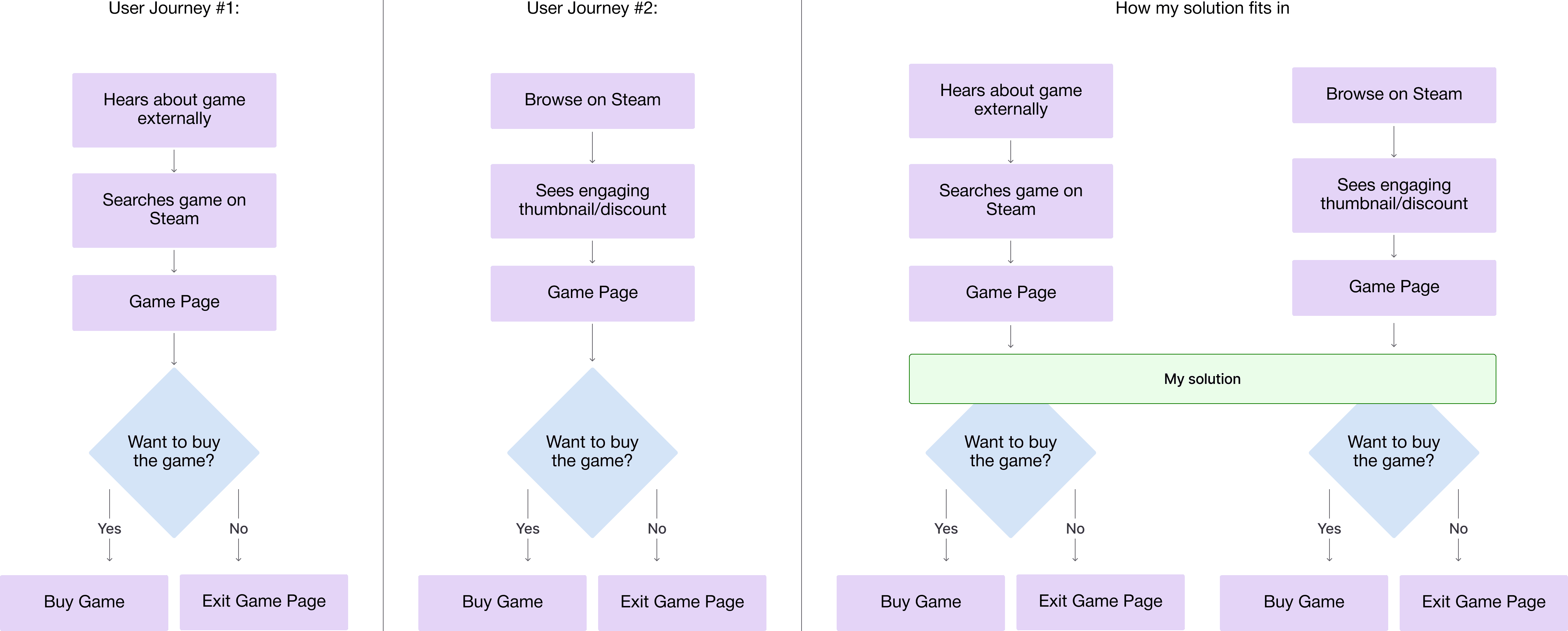
Two most common discovery to purchase user journeys on Steam, based off user interviews, and how my solution fits into those journeys.
📣
Rather than eliminating the decision-making process entirely, this solution aims to help shorten it.
It helps users move from initial interest to confidence more efficiently, while still allowing them to make informed decisions at their own pace.
OPPORTUNITIES
Building confidence through fun, genuine moments
More than just attractive graphics and discounts, we need build off what we already have and re-introduce short-form content.
While engaging graphics and appealing discounts effectively lure users in to click into a game, interviews revealed that most times, it isn't enough to maintain interest and build purchasing confidence. Users shared that a deeper emotional connection, like seeing funny and relatable gameplay moments, would help them feel more confident and sure about their decisions.
Thinking back to my Steam audit, I noticed that Steam already has a video and sharing feature within specific game community pages, allowing users to upload and share their funny and unique moments. However, it is isolated from the actual game as it's entry points are hidden away. Which leads to it not being utilized proactively to promote the game.
My process of finding videos related to a game I'm interested in (Game Page -> Community Hub/Find Community Groups -> Videos)
After analyzing and conducting competitive analysis on similar websites and apps on how they keep users interested, and understanding how Steam has already built a starting foundation for clips and videos, I concluded that showing the short-form content (clips and videos) on the specific game page, instead of redirecting users back-and-forth, was an effective way to maintain user engagement and influence purchasing decisions.

Being able to find short-form content quickly on other platforms to maintain user engagement.
EARLY DESIGN CONCEPTS
I explored three entry points for users to easily discover clips & videos
Before designing, I created mid-fi mockups and explored different design decisions on how clips could be intuitively showcased to influence purchasing decisions.
Clips as a new section - Design Concept #1

A global "Popular Clips" tab - Design Concept #2

Redirecting from Game Page → Redesigned Community Page - Design Concept #3

I ultimately moved forward with Design Concept #1 (Clips as a new section in the Game Page) as it best supports users at the moment of decision by surfacing relevant gameplay clips directly on each game’s page, at the point of evaluation. At the same time, Design Concept #3 (Redirecting from Game Page → Redesigned Community Page) stood out as a complementary entry point, increasing clip visibility within the game’s community page and presenting an opportunity for another visual and information architecture update.
Design Concept #2 (A global "Popular Clips" tab) was considered a “nice-to-have” for casual browsing. However, the primary goal of this redesign was to support confident purchasing decisions at the point of evaluation.
DESIGN DECISIONS
While designing, I wanted to make sure it felt naturally integrated and not impractical
While designing the first concept, I noticed that the sidebar of paused videos was impractical. Without motions or interactions, this section felt inactive, leading to valuable space wasted and underutilized. Although having a preview of upcoming clips is a nice idea, the overall layout ended up feeling more cluttered than useful.
I took a step back and re-evaluated how I wanted to present game clips in a way that felt naturally integrated into Steam's current UX.
Static Top Rated Clips - Design Concept #1
Dedicated section to show a few top-rated clips. Clips are presented in a grid format, allowing users to focus on the main clip, and are able to select the other clips on the mini sidebar.

Autoplaying Clip Carousel - Design Concept #2
Clips are presented in a horizontally scrollable carousel, continuously playing top-rated clips. Similar to the current image gallery interactions on Steam.

Autoplaying Vertical Feed - Design Concept #3
Clips are automatically played in a vertical feed, similar to YouTube Shorts and TikTok. Users can scroll to the next Clip by clicking the arrow button or scrolling.

After evaluating the different design concepts and layouts for the "Clips" section, I landed on the second design concept, an autoplaying horizontal feed, as it encourages continuous viewing and makes the experience engaging, allowing users to be confident in purchasing decisions. This concept addressed key pain points around the lack of viewing meaningful gameplay and using short-form content to build bonds.
FINAL DESIGNS
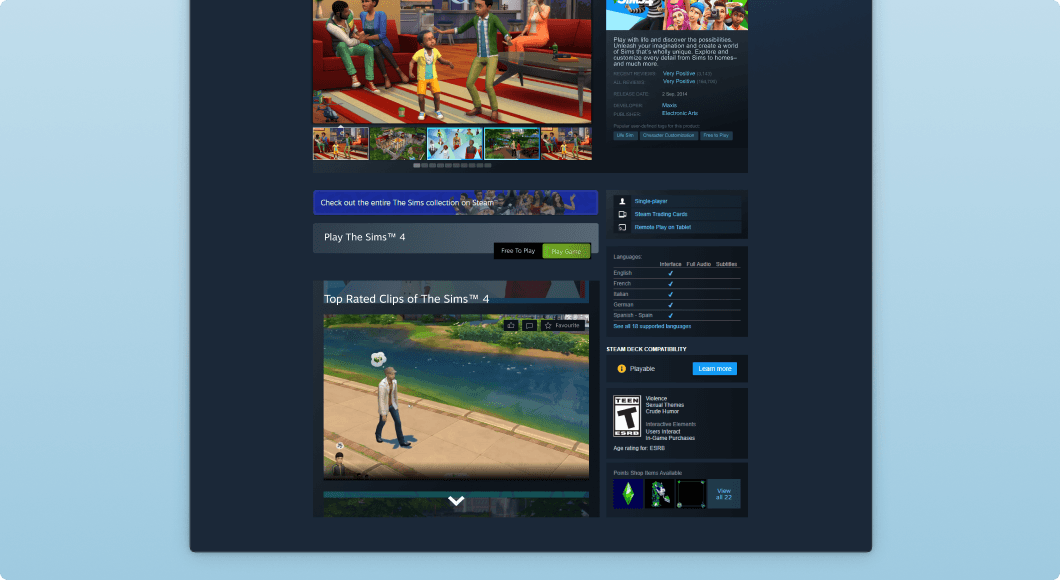
A compact, yet impactful feature to help users feel confident in their purchasing decisions.
Introducing a new section on every game page — Top Rated Clips!
A continuous, horizontally scrollable carousel to easily watch infinite clips
Top rated clips are shown to influence purchases
Expanded views of all the clips in a pop-up, allowing users to continue exploring new content without losing context
Interactive clip actions (like, dislike, comment, favourite), fostering engagement
Short-form content on Steam to build purchasing confidence and eliminate indecisiveness

CHECK THESE OUT!
Project Rene
Designing non-verbal communication systems for seamless player collaboration and internal tools that enhance development workflows.
AMD
Creating player-focused experiences at AMD by conducting user research and designing consistent, scalable interfaces.